Influences + codes and conventions of the industry.
v
 The GQ magazine features:
However, GQ is an example of a popularist cover, Vogue magazine is the worlds leading Female fashion magazine. And apart from having a large male version, aesthetics and design comes from a more decadent ideology.
Magazine codes and conventions:
Following a pluralistic approach to the male fashion industry my magazine will be trying to contrast cultural codes which are otherwise commonly being used in the wide mass media market. The codes in which I wanted to contrast came from modern male magazines, a prime example being the male GQ magazine (pictured below).
The GQ magazine features:- A close mid-shop of a celebrity who is directly in the middle of the cover. This puts him in direct line of sight of the viewer. The model is suited up and looking smart to emphasize the importance of the model.
- The magazine itself has its mast-head/ logo at the top left of the cover to eye-catch.
- The colour palate used its neutral and compliments the models attire whilst also denoting masculinity through its use of blue and gray.
- the style is modern, the lettering is minimalist and the use of graphics is profound with paragraph boxes to separate text and a plain background to create depth to the image and anchorage to the text.
However, GQ is an example of a popularist cover, Vogue magazine is the worlds leading Female fashion magazine. And apart from having a large male version, aesthetics and design comes from a more decadent ideology.
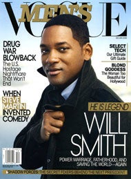
Vogue Men magazine's design includes:
- Brighter design palate, including bright shades of blue and gold which connote power and wealth.
- Bigger mast-head which spans the upper third of the page.
- Use of wider range of fonts:
- Cursive font for title denotes decadence and connotes aristocracy
- Minimalist font of subheadings and main text for simplicity, compliments the of the title by connoting business.
- Mid shot of the celebrity emphasizes power and prestige